Monday, April 27, 2009

Untitled

A quick abstract drawing done in pencil. The figure in the middle is a collection of magnets of different shapes. The background was supposed to be very abstract, but it doesn't really go with the magnets, which are a concise object. There is not muchmeaning to this piece, basically a quick piece done for an assignment early in the year.
.October

The Mirror's Truth

A piece inspired by Rene Magritte's "C'est pipe n'existe pas". It's a play on the basic idea. It's a brain floating around in ethereal matter, with captions under it, which say "Le miroir est un illusion", which means "The mirror is an illussion". Under it there is another caption that when held up to a mirror reads "Ceci n'existe pas", which translates to "This doesn't exist". It's supposed to represent that our reality is only revaled to us by our five senses, but there is really no way to know for sure that we are here and that this reality is indeed a reality and not just a simulation. This piece is a watercolor monotype. Since it is very difficult to control watercolor, I think that I shouldn't have chosen that medium for this piece. The captions are very hard to read. If I had a chance to do this piece over, I would definetely do it in color pencil, which allows me to use much greater detail.
.December

What Lurks Within

This is a re-work of a piece I did earlier in the year. I chose to remake it because the composition and subject of the original piece didn't make much sense to the viewer. The new piece, I believe, makes the message much clearer. It's a pregnant woman holding her belly. The viewer can see inside of her, and also see her baby, a dark fetus, developing in her womb. This piece is supposed to say that, even though you want good things to come out life, this is not always the case. Bad things will happen and one just doesn't have the ability to predict them or the power to stop them from happening.
.January

Hope

This piece was done in color pencil. It was very laborious since color pencil needs a lot of time for it to get on the paper without leaving traces of white on the paper. I wanted to add a lot of tensipn to t he piece, so I used complementary colors, such as purple and yellow and blue and orange. I also used flat areas of shading, to add contrast, and filled the background with red, which is a great color for tension. The way I got the texture on the hair was that I first colored the hair a flat purple. I then used an eraser for both highlights and texture, since the erased away color pencil left little dots of dark color. For the edges of the hair I used an exacto knife to slightly draw out the purple from the main body of hair to create single strands of hair which would add detail to the piece. This piece is about hope and equality, about the struggle that we have had to create a world with equal opportunities for everyone. And while we are still not there, there will always be revolutionaries fighting for it.


.October

The Fish

I chose cubist impressionism for the style of this piece because I wanted an style that would portray feeling and emotion, not concise shapes. The fish represents Christianity, jumping out of the green grass/mountains that represent our world. He is looking up at the soon, with a brown symbol in it. While in many parts of the world this can be recognized as the Japanese character for peace, in can also be seen as an upside down cross. The red shards under the fish are meant to represent hell, and they are supposed to show that the fish, instead of jumping out of our world, is jumping out of hell. The white of the background represents the peace which the fish is supposed to symbolize, and the red is the blood spilled that the fish has caused.


.December

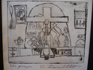
The Prayer

This is an etching print, done with ink. To do it, one has to carve out plexiglass in the patterns that one wants, flipped, because once it is passed through the printing press the image will be flipped. One then rubs the whole of the plexiglass with ink to get it into the crevices, and then with a block and newsprint, one rubs the plexiglass to remove excess ink and to further get it into the crevices. Once that is done, the plexiglass is ran through the press and one gets a shiny new print. The kneeling skeleton in the middle of the print is death, praying to the cross. All around him are examples of Christian persecution by others, mostly the romans. There is a cat'o'nine tails, Christians burned on crosses, being hanged upside down, eaten by lions, etc. There is also a bible with a note in it. It says: Mark 11:17, which refers to the passage of the bible :

17
And as he taught them, he said, "Is it not written:
" 'My house will be called
a house of prayer for all nations?'" But you have made it a den of robbers."

On the right, there is an apple covered. On top of it, one can see the inscription 'Mallus'. Basically, in the original Hebrew, the word used to describe the apple that Adam and Eve ate which caused them to be banned from Eden was the Fruit of Evil. Never does it say 'apple'. When it got translated to Latin, it became 'Mallus". The latin read 'the Fruit of Mallus', or fruit of evil. But 'Mallus', in latin, also means apple. When the bible got translated from latin into other languages, it seems the translators thought it would be very interesting for them to change the 'Fruit of Evil' into the 'Fruit of Apple'. Obviously, in english and in many languages that doesn't make too much sense, so it just became ' the apple'. Behind the skeleton and the cross there is a glass mural which is cracked, showing the persecution that Christians have caused all throughout history. This piece is basically a political/religious statement about hipocracy and contradictions in major publick institution, not Christianity itself per se. It was just the easiest to do, because of readily available information and clear examples. It also allows for greater impact, since a higher percentage of the population, at least in America, is Christian.


.November

A Dream's Nightmare

A while ago I had a few problems coming up with an idea for a new piece. Finally, one day, while I was sitting around probably not doing much, inspiration struck me. I remembered back to my childhood, when on the wall of my room there was this very cute clock mounted. It had a rocking horse and teddy bears and all those cutesy things you'd expect in the room of a child. But I didn't see it that way. One night, and I don't remember if it is a dream or not, I remember seeing dark shapes, shadows, and monsters coming out of the clock, and it terrified me. From there, I realized that I wanted to show that some things, even if meant with good feelings, are not what they seem they are. So I decided that I would portray a very isolated rag-doll, with one of its button eyes falling off, a very creep face, and stuffing coming out of it. The only light source shines right on it, which makes it the most important part of the piece. I also used the 'grid' to place it where the grid lines intersect, to make it clear that it's an important part of the piece. The shadow of the rag-doll becomes this terrifying monster, which seems like it's about ready to eat the viewer. The contrast of the shadow with the white of the wall adds some great edgy-ness, The great size of the table amplifies the feeling of being overwhelmed, and of fear, and the lack of anything else but the rag-doll and the shadow create feelings of solitude and desperation on the viewer.
.February